Mobrak: A Serif Display Font That Elevates Digital Branding
It started with a hero section. I was redesigning a boutique online store for a small ceramics brand—hand-thrown pieces, earthy tones, quiet confidence—and the headline needed to feel intentional, not loud. I tried three fonts before landing on Mobrak. Not because it was flashy, but because it carried weight without shouting. Its clean serif structure has subtle tropical warmth—gentle curves, open counters, balanced proportions—but never veers into ornamentation. It’s minimalist, yes, but deeply expressive.
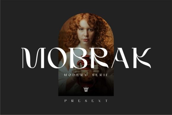
Mobrak sits comfortably in the serif category, yet it reads like a modern display font first and a traditional serif second. That duality is its strength. The letterforms have just enough character to suggest craftsmanship and care—think of the soft terminals on the ‘a’ and ‘e’, or the graceful taper on the vertical stems—but remain highly legible at scale. On desktop, it shines in 48–72px headlines. On mobile? I tested it down to 32px in the hero banner, and it held up beautifully—even over a softly blurred background image. No pixelation, no visual fatigue.
I used Mobrak for three key roles across the site: the main logo lockup (as SVG text), primary section headers (Our Process, Seasonal Collection), and CTA buttons (Shop the New Batch). Each time, it reinforced a consistent tone: thoughtful, grounded, quietly confident. It didn’t compete with product photography—it framed it. That’s rare for a display font. Many serif fonts either recede too far into “classic” territory or lean too hard into decorative flair. Mobrak walks the line with precision.
Readability in real-world layouts mattered most. I checked contrast ratios against both light and dark backgrounds—Mobrak’s generous x-height and open apertures helped maintain clarity even at 24px on charcoal gray. For buttons, I kept copy short (Join the List, See Details) and paired Mobrak with a neutral sans serif (Inter, set at 16px) for supporting text. That pairing created instant hierarchy: Mobrak sets the mood; Inter delivers the message. No cognitive load, no ambiguity.
What surprised me was how well Mobrak worked in unexpected places. On the blog’s featured post cards, I used it for titles only—no subheads, no bylines. Just the title, centered, with ample whitespace. Scannability improved immediately. Visitors paused longer. On the course sales page for a digital branding workshop, I applied Mobrak to the core value proposition (“Clarity starts with intention”) and let body copy breathe in a clean, variable sans serif. The contrast didn’t distract—it deepened trust. Users associated the font’s calm authority with the instructor’s voice.
This isn’t a font for long paragraphs. Mobrak is a display font, designed for impact, not endurance. It thrives in short bursts: headlines, logos, banners, social media graphics, email headers, digital ads. I wouldn’t use it for navigation labels or form fields—not because it’s illegible there, but because it dilutes its own impact. Reserve it for moments where you want users to *feel* something before they read anything else.
Font pairing is where Mobrak truly sings. Its personality pairs best with understated sans serifs—Inter, Manrope, or even system fonts like SF Pro or Segoe UI for maximum performance. Avoid clashing serifs or overly geometric sans fonts; Mobrak’s warmth needs breathing room. I skipped script or handwritten fonts entirely—they’d fight for attention instead of complementing. For editorial-style sites or portfolio pages, Mobrak + a crisp monospace (like JetBrains Mono) for captions or code snippets added a lovely tactile rhythm.
Before deploying, I verified webfont availability. Mobrak includes WOFF2 files, multiple weights (Light, Regular, Medium, Bold), and basic Latin multilingual support—enough for English, Spanish, French, and German markets. No OpenType features like stylistic alternates or ligatures, which kept things simple and loading fast. Licensing was straightforward: a commercial license covered website use, client projects, and digital templates. No hidden restrictions for SaaS dashboards or e-commerce platforms—just clear, ethical usage terms.
On mobile, I paid special attention to line height and letter spacing. At 32px, I increased tracking by +20 to prevent crowding on smaller viewports. I also tested it in Safari’s reader mode and Chrome’s accessibility settings—Mobrak remained visually intact and retained semantic meaning when styled with proper heading tags (, ). That consistency matters for both SEO and screen readers.
For creative professionals building a digital brand kit, Mobrak works as a foundational typographic anchor. It doesn’t scream “trendy”—it whispers “considered.” That makes it ideal for coaching websites where authenticity matters, portfolio sites where craft should speak first, or campaign landing pages where emotional resonance drives action. It’s not about standing out at all costs. It’s about standing for something—with clarity, calm, and quiet sophistication.
If you’re choosing a font for your next project, ask yourself: does it serve the user first, or the designer’s ego? Mobrak serves the user. It guides the eye, supports meaning, and adds warmth without clutter. It’s proof that minimalism, when done right, isn’t empty—it’s full of intention.